Components and Capabilities
Side panel
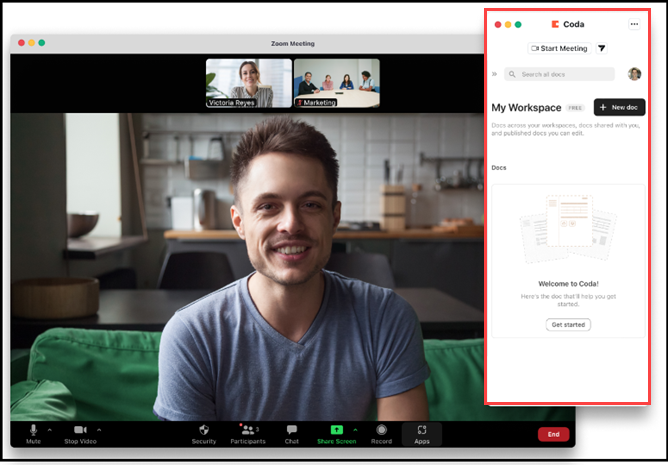
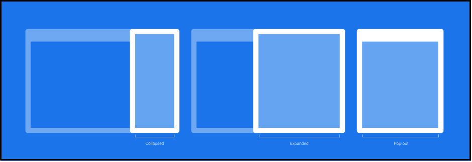
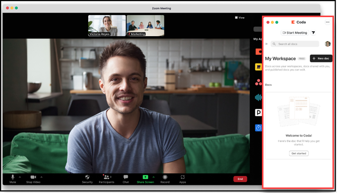
The majority of Zoom Apps engagement is built into the side panel with options for collapsed, expanded, and pop-out modes. The default view is the collapsed side panel.
Collapsed and expanded views
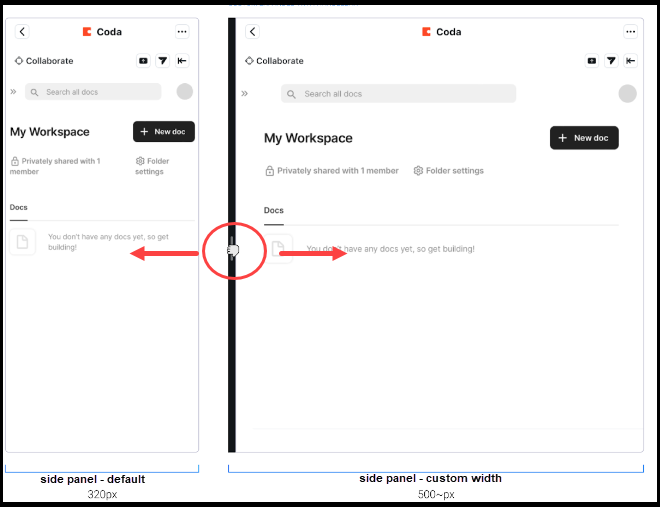
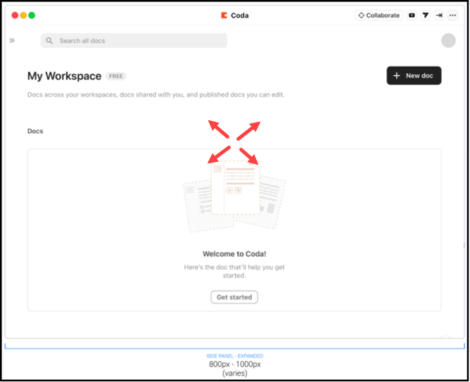
The collapsed view is the default view for the side panel. With both collapsed and expanded views, the user has the option to use the handlebar to increase or decrease its width.
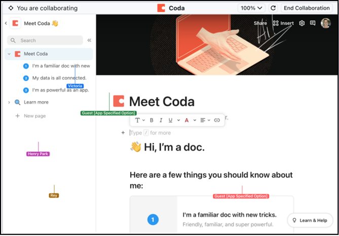
Side panel - collapsed view with handlebars
Side panel - expanded view
Collaboration mode
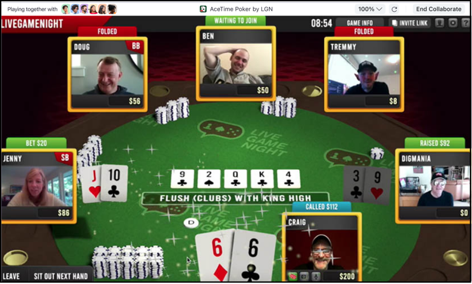
The goal of the Collaborate mode for Zoom Apps is to interactively bring all participants to the same page inside the app without friction. Collaborate mode enables Zoom App users to instantly collaborate with other meeting participants by seamlessly bringing them together within the same app.
The experience is progressively enhanced, depending on the role and permissions available to the participants. When participants cannot join Collaborate mode due to account restrictions, the experience gracefully shifts to a screen-share of the initiator's app view.
For games, developers can choose to rename the CTA and associated copy to "Play Together" by toggling the "Play Together" mode in the app build flow.
Examples of shared objects:
- A slide-sharing application that allows users to navigate between slides, but always displays the presenter's active slide visibly for all collaborators.
- A document editor keeps all participants within the same document and highlights the author's current position.
- A game that sends participants into an active gaming session as the focus for the "Play Together" experience.
Immersive View (team view)
The Zoom Apps Layers API (Immersive Apps) gives developers sophisticated control over the meeting experience. Layers enable you to control and customize the meeting canvas, participants' video streams, images, and content within the canvas.
Team view enables your app to become the meeting canvas while receiving the participant videos as cutouts (removes virtual backgrounds and foreground elements).
Pop-out
Pop-out mode gives users flexible control to view and use an app in a meeting. Its sizing defaults to the current view. If the user is in the collapsed view, the pop-out window will be in the height and width of the collapsed view. If the user is in an expanded view, the pop-out window will be in the height and width of the expanded view.
Pop-out
App panel - not popped out
App panel popped out and app launcher is present
App panel - popped out and app launcher is closed